Monthly Archives: February 2013

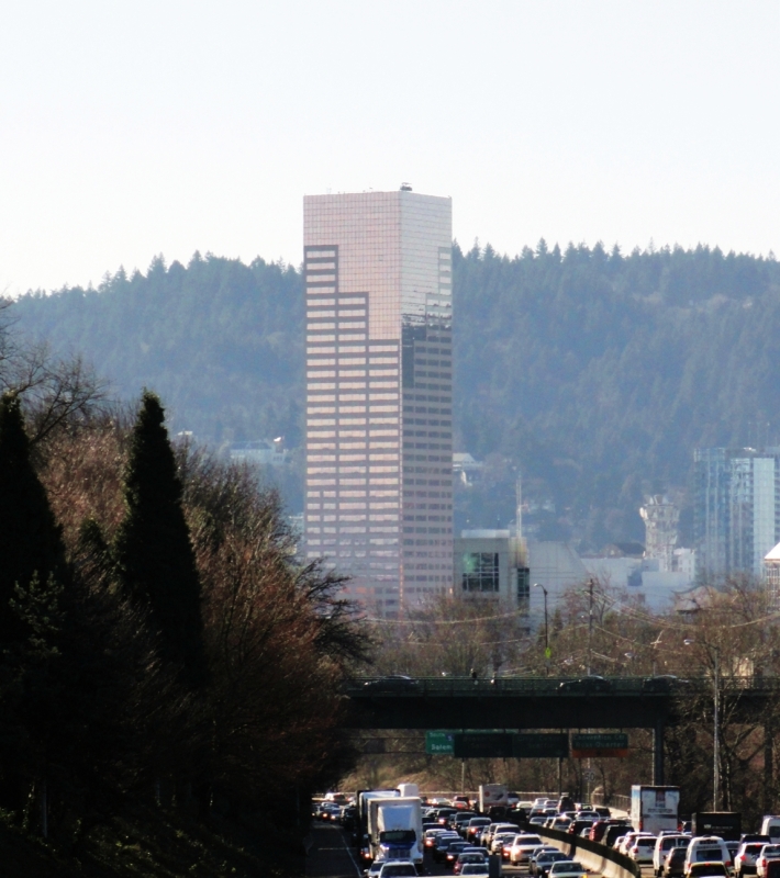
US Bancorp Tower (“Big Pink”)

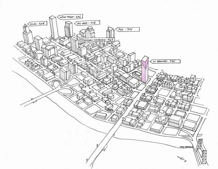
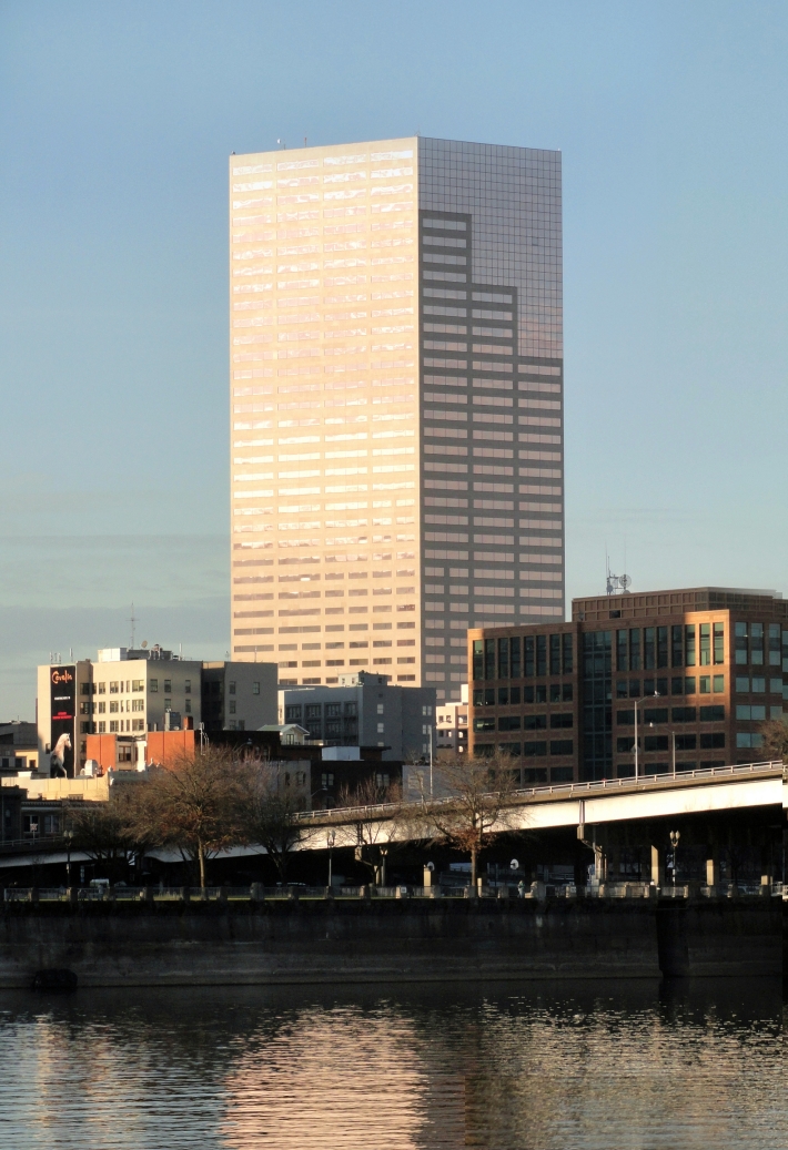
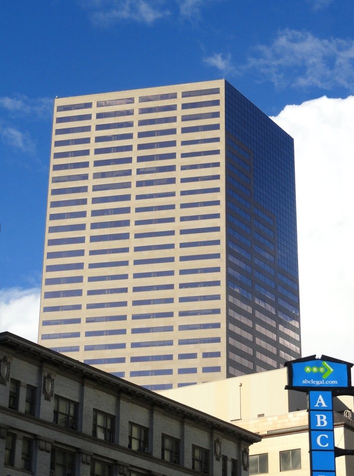
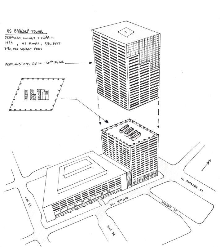
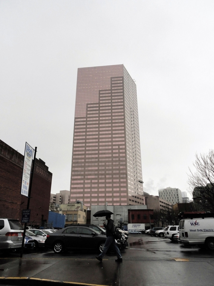
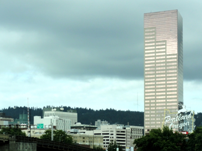
At 536 feet, The US Bancorp Tower is Portland’s second tallest building.  This modernist structure was designed by Skidmore, Owings, and merrill with Pietro Belluschi as a consultant.  The tower’s odd shape is a response to the unique diamond-shaped site on which it’s built.  The result is an extruded parallelogram-shaped tower with an ever-changing scale and proportion.  From the east or west, the building appears slender and tall.  However, when viewed from the north or south, the tower appears squat and wide.

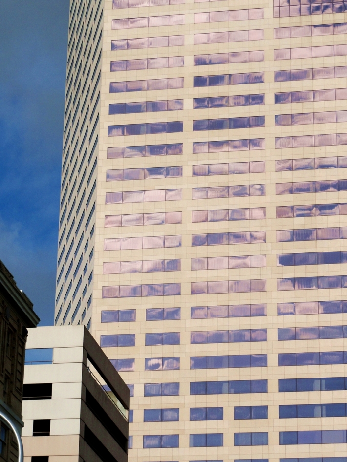
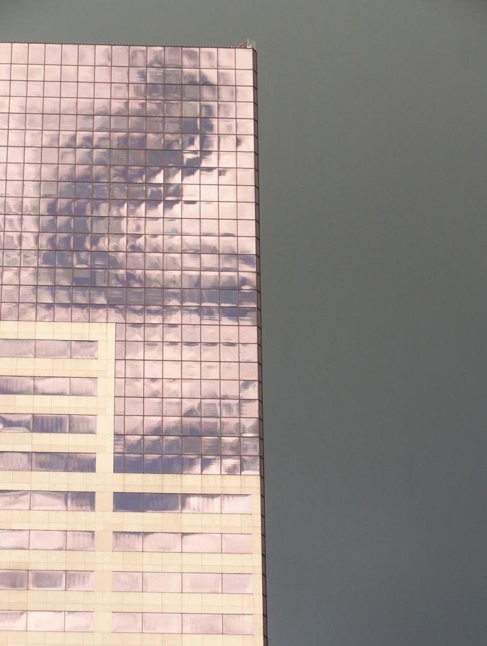
The distinctive exterior cladding of copper and silver coated glass with Spanish granite gives the building  a variety of colors and textures.  Depending on the time of day, season, weather, and viewing angle, the it can appear pink, tan, orange, brown, gray, and even greenish.

The building’s tenants are almost exclusively commercial offices.  However, The Portland City Grill can be found on the 30th floor.  I took my prom date to eat there and we thought it was incredible.  Great views- sorry I didn’t take any pictures at the time!

Here are my photos and sketches:

Image

Image

ImageImageImageImageImageImageImage

Tagged , , , , , , , , ,

New State of Oregon Flag Proposal

When I began this blog over a year ago, I made a decision not to attach my own commentary on the local Oregon design that I feature. Many featured projects on this blog are controversial but I chose to focus on their design merits instead (examples are the OHSU tram, lightrail expansion, bridges, etc).

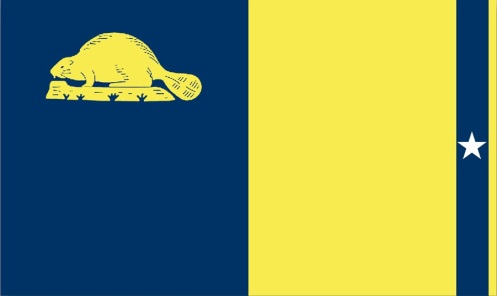
However, upon seeing Matthew Norquist’s proposal for a new state of Oregon flag, I knew immediately that I would be breaking my non-commentary rule. Mr. Norquist is a Gresham resident who has helped introduced Senate Bill 473 for a proposed new state of Oregon flag.

You don’t need to be a designer to spot bad design. I am a designer however, and here are some of my problems with the proposed flag: Aside from the dull yellow and bland blue, the star’s size and location present an obvious tangency issue. The proportions are a problem as well. Despite the water/agriculture symbolism  the thin strip of yellow at the end appears superfluous and unnerving to look at. The beaver is the correct size in relation to the whole flag, but much too large for the blue field in which it is placed. All the elements in this flag are competing for attention and it feels very inharmonious.  For examples of what I consider very good flag design, check out these Japanese prefecture flags.

I agree with Mr. Norquist that Oregon’s flag is bland and similar to other state flags (with one distinction- ours is two-sided). I also really respect his initiative and desire to have better design representing our state.  Unfortunately this isn’t better design and I worry that if adopted, it will be hard to replace anytime soon. Check his website if you want to learn more about his proposal.

Front and back of current flag:

Image

Oregon State Flag, Front and back

Tagged , , , , , , , , , ,