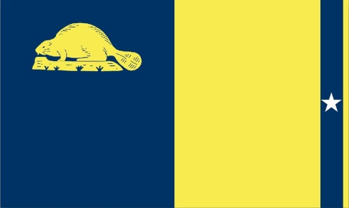
When I began this blog over a year ago, I made a decision not to attach my own commentary on the local Oregon design that I feature. Many featured projects on this blog are controversial but I chose to focus on their design merits instead (examples are the OHSU tram, lightrail expansion, bridges, etc).
However, upon seeing Matthew Norquist’s proposal for a new state of Oregon flag, I knew immediately that I would be breaking my non-commentary rule. Mr. Norquist is a Gresham resident who has helped introduced Senate Bill 473 for a proposed new state of Oregon flag.

Matthew Norquist, http://www.neworegonflag.org/
You don’t need to be a designer to spot bad design. I am a designer however, and here are some of my problems with the proposed flag: Aside from the dull yellow and bland blue, the star’s size and location present an obvious tangency issue. The proportions are a problem as well. Despite the water/agriculture symbolism the thin strip of yellow at the end appears superfluous and unnerving to look at. The beaver is the correct size in relation to the whole flag, but much too large for the blue field in which it is placed. All the elements in this flag are competing for attention and it feels very inharmonious. For examples of what I consider very good flag design, check out these Japanese prefecture flags.
I agree with Mr. Norquist that Oregon’s flag is bland and similar to other state flags (with one distinction- ours is two-sided). I also really respect his initiative and desire to have better design representing our state. Unfortunately this isn’t better design and I worry that if adopted, it will be hard to replace anytime soon. Check his website if you want to learn more about his proposal.
Front and back of current flag:


It looks like a bad parody of the California state flag.
I agree. I don’t understand why the beaver is facing away from the star. The bear on California’s flag is walking towards (or at least along with) the star.
I think if the flag is redesigned it should represent something of the Oregon trail and still include the date.
I once saw a flag proposal that had a covered wagon on it. It was too literal and didn’t look very good, but I do like the idea of a reference to the Oregon trail (even if it’s a very abstract reference).
I like the flag except for the blue stripe and star on the right. Keep it simple. Remove those and you have a great, distinguished flag. No words or dates; leave that for militias.
Ouch. Though I respect Mr. Norquist’s initiative, his design is pretty weak. My proposal features a blue field with a gold beaver in the canton. Two horizontal yellow stripes near the bottom represent the Oregon Trail and break up the somewhat monotonous blue background.
I do not agree that a date should be included on a new Oregon flag, or any flag.
You can see a variety of state flag proposals in my book Geobop’s State Symbols, which will be published early in 2019. Learn more about my project
2 http://www.kpowbooks.com/symbols
your ridiculous blue and yellow are not dull, punk yourself in the face, everyone always wants to change a perfectly good bthing because they are boring and need excitement to feel fulfilled.